 Keven Elliff
Hi, please visit http://centrum.org. We’ve embedded newsletter signups and video embeds in sidebar widgets at a width of 230 pixels. However, when screen sizes get smaller – as in tablets – and the sidebar itself gets smaller. In most responsive designs we’ve seen, the widget size stays the same, and it just hops down to the bottom. Is there a way to fix the width of the sidebar, or if not – how can I keep a newsletter signup form and a video embed within the sidebar and behave responsively. Appreciate any advice. Thanks. (Love the theme)
 Wilfred
Hi Keven, To resolve this issue, please follow my instruction here: – Add following code to header code in Dashboard / Appearance / Customize / General setting
  <style>
 .textwidget iframe {
 max-width: 100%;
 }
 .textwidget .newsletter {
 max-width: 100%;
 width: 100% !important;
 }
 .textwidget .newsletter input[type=text] {
 height: 30px;
 max-width: 100%;
 width: 100%;
 box-sizing:border-box;
 -moz-box-sizing:border-box;
 }
</style>
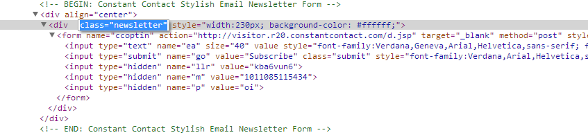
– Add following code to div in newsletter. (see screenshot)
class="newsletter"
Hope this helps!
Thank you for your suggestions. Unfortunately, these don’t seem to change the behavior. As you can see in the screenshots, the sidebar reduces in width as window size diminishes.
larger window: https://dl.dropboxusercontent.com/u/3863773/larger.jpg
smaller window: https://dl.dropboxusercontent.com/u/3863773/smaller-size.jpg
 Dominic
Hi Keven !
I have checked your site and see that you have added the newsletter class but you didn’t add the Custom css to the Header Code (Dashboard > Customize > Custom Code.)
After adding the code to the Header Code section. If you still face there issue, please send me username & password of your site (via private answer) for further checking.
Regards,
Hi Keven,
The problem was that the code line: class=”newsletter” was in wrong format.
I have fixed this issue for you.
 Keven Elliff
thank you!
Wilfred – do you have suggestion for how to keep the width of the sidebar unchanged? i’d really like to see that sidebar width fixed at 230, so that when a smaller screen access the site it doesn’t display a tiny sidebar – it either shows it on the right, or if the screen can’t do it, displays it at the bottom. that’s usually what we see with sidebars in responsive themes. thx in advance.
Hi Keven,
To keep the width of sidebar unchanged, please add following code to header code in Dashboard / Appearance / Customize / General setting:
   <style>
@media (max-width:1079px) and (min-width:980px) {
 #primary {
 width: 670px;
 }
 #main>.container>.row {
 background-position: 715px top;
 }
 #secondary {
 width: 230px;
 }
 .news-slider .carousel {
 width: 425px;
 }
}
@media (max-width:979px) and (min-width:768px) {
 #primary {
 width: auto;
 }
 #secondary {
 width: 100%;
 }
}
</style>
Hope this helps!
Please login or Register to submit your answer