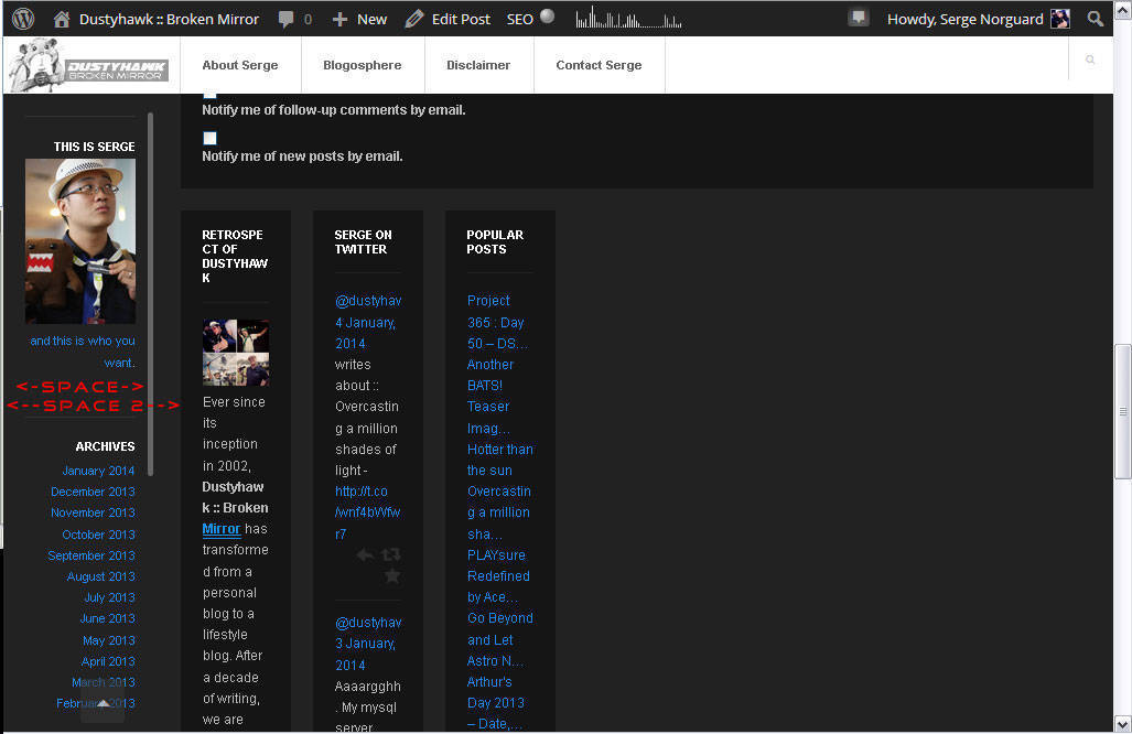
 As per the screenshot above, i have added the following CSS #sidebar-secondary { width: 360px; #sidebar { width: 165 px; } #container { padding-left: 1px; } My questions are
1. in the part of <-Space-> , how do i increase the width of that part so that the text in it will be roughly the same width as <–Space 2–> ?
2. in the secondary sidebar area, I would like to get each widget to be able to contain items that have a larger width, e.g. 300px
1. To change width of the left sidebar, you can add the following code to the “Header Code”
 <style>
#sidebar {
     width: 200px;
 }
 #main {
     padding: 50px 8px 10px 200px;
}
</style>
2. To change the secondary sidebar, please add the following code to the “Header Code”
 <style>
#sidebar-secondary {
    width: 300px;
}

 .widget-inner {
     max-width: 100%;
}
 </style>
Hope this helps !
Then the responsive design is broken, any fix for that?
Please add the following code to the “Header Code”
@media only screen and (max-width: 985px) {
#main {
padding: 50px 10px 10px !important;
}
}
Hi, I got problem in responsive design too after I added codes above to make sidebar wider. I added this code below that you shared exactly to the end of lines in "Header Code" but I only get it as a text on my main page. I tried to add the code to header.php and "Header Code" section in Customize/Custom Code/Header Code but I only get it asa text in main page. Please help.
@media only screen and (max-width: 985px){
main {
padding: 50px 10px 10px !important;
}
}
Oh I solved now! Need to take the code between style tags like this:
And write it to appereance/customize/custom code/header code.
Oh I wrote but where style tags gone?
You can needn’t use this code in the "customize/custom code/header code" section which you can add this code to the style.css file that needn’t to take the code between style tags. 😀
Note: At the moment, will not display the "style" tags at here.
Please login or Register to submit your answer
